When a Website Visitor Loves Your Website They Will Buy From You.

Our websites are well thought out and custom built using this standard.

CHECK OUT OUR RECENT WORK

Custom Solutions & Industry Leading Design Make A Website That Sets Sales Records.

Over 6 years and two full websites later, Notice U Marketing has built a myriad of custom website solutions, managed, optimized and improved the full sales funnel for Brian Head Resort.

The Big Highlights:

  • Functionally, we built Brian Head a two website solution that earns SEO ranking all year. Summer and Winter websites live together with one effectively hidden from the public while the other is live. This allows for year long editing and SEO to raise the website’s search ranking.
  • We custom coded multiple tools to open and close lifts, trails and other property amenities due to conditions like weather and seasonal conditions.
  • We incorporated their POS system sales window into the website to make sales fast and easy.
  • We custom coded an infopanel into the header that allowed people to quickly get the most sought after information from any device.
  • Our reworking of the sales funnel, the search ranking gains, the better marketing landing pages contributed to a 174% year over year increase in sales and conversions the year the website launched!

Client Project Goals: 

Brian Head Resort needed a state of the art website that would:

  • Showcases ideal outdoor conditions winter and summer.
  • Provides people with immediate access to information regarding conditions.
  • Change to match the Summer and Winter seasons.
  • Entice visitors to their luxury ski resort all times of the year. 
  • Capture ticket and season pass sales
  • Showcase amenities like Ski School while getting reservations for those. 
  • Drive traffic to specific lodging and retail partners.
  • Track sales and traffic sourcing.
  • Map all visitor journeys.

We accomplished this using fully integrated and TRACKABLE platforms. 

The Result:

  • The result is a streamlined look and feel that is both unique and highly functional while looking great on all devices.
  • This website is better than most cookie-cutter websites visitors see at competing ski resorts.
  • It is easy to train Resort staff to use.
  • Time on site went up 46% from the previous website to the current website.
  • Conversions went up 174% year over year!
  • This website has been a major driver of sales records 6 years in a row.

Time savings: The custom built, low maintenance, time-based tool that made it easy to communicate when lifts and activities were open and or closed. This tool alone saved more than 2 hours per week of website work for their on-site teams. 

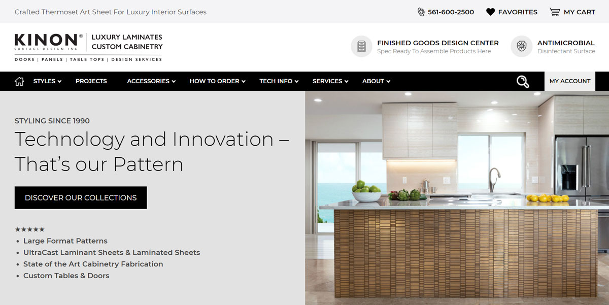
KINON

You may not recognize the Kinon name, but you definitely recognize their finishes. You may have seen them at the Aria Hotel Casino or in a Louis Vuitton store. Kinon is America’s foremost supplier of premier surfaces for interior applications on areas as varied as elevators, hotel lobbies, spas & bathrooms, bedrooms, and manufacturing facilities. Chances are you have been impressed by the unique patterns and materials used in the luxurious walls and furniture where Kinon was used. They also do tiling, fabrication, and finished goods.

We recently completed an extensive 5-month project to build out Kinon.com.  Their new website features over 250 products, a highly specialized search / filter system, and tons of custom features to support their online business.

Client Project Goals:

The existing site was cumbersome and failing to meet growing needs of the company and their users. The new website had to be visually appealing with a high-end, design forward aesthetic. The site had to serve users a full eCommerce experience and make ordering any item easy and fast. The new website had to give users the ability to find and request samples and to place orders.

Some other key needs included:

Eliminating piracy of patterns by competitors.
Making sure the site is editable by Kinon personnel.
Making sure only logged in users can access certain content.
Serving the needs of installers, manufacturers, designers, and end consumers in equal fashion.
Showcasing a new division of finished goods and custom work.

The website had to make it possible for designers to spec out Kinon Surfaces within their plans and presentations for creating the most high end, luxurious brand experiences in the world.

The Result:

The website looks and functions immaculately. The Kinon brand looks as good online as it does on the decors their luxury brand customers produce.

Notice U Marketing’s graphics team thoroughly refined the look of the website from home page to product pages before the wire frames were started. This allowed our team and the client to work out user experiences and interfaces well ahead of design.

The total project required over 200 development hours and 30 graphic design hours with 7 team members working feverishly to develop, test, break, fix, and finalize the website.

With hundreds of variants in color, patterns, feel and materials it became a major need to have a custom filter system whereby users could search for specific patterns, colors, or search a selection of products based on tone or by design aesthetic. This tool alone took nearly 100 hours to develop.

Today the site contains over 250 products that show patterns, spec sheets, accessories, and more — all easy to find.

We built the site with Search Optimization in mind. It is constructed so patterns and products start to rank in search. Prior to the website build products were unintentionally hidden from Google. By adding content and modifying  product presentation Google can now find them.

We created an enriched website that features:

  • Custom customer account system that allows them to access restricted areas on the website and download material restricted to the general public
  • Custom product search functionality
  • Online forum that includes helpful technical information
  • Fully custom-built WordPress theme with every aspect built to client specifics
  • Custom plugins to control server caching of webpages
  • Online store with over 250 products
  • Custom product page templates that control the display of each product page. Each category of products has a different page layout and product specific content
  • User approval functionality where the administrator controls new users
  • Additional user registration fields to collect unique information upon user account creation
  • Speed optimization is built into the theme from the ground up
  • SEO optimization is built into the theme
  • Connectivity to a content delivery network built to increase speed

Baldini’s Casino

Baldini’s is a local’s gaming and sportsbook mainstay in Reno, Nevada, since the late 1980’s. It’s favored because of rate of return, food, and customer service. Their website had aged well but needed a long overdue revamp. Badlini’s brand and service offerings continuously evolved but the website did not.

Client Project Goals:

Modernize the website.
Add excitement and “sizzle” to promotions.
Tell the Baldini’s story of value, fun, and winning.
Keeps people coming back.
Increase the number of website visitors turning into casino visitors.

The Result:

Chad, our Operations Manager made this website endeavor his personal project. He adopted it, embraced it, fed it, and coddled it from start to finish. It was his personal puppy, and no one was going to mess with it.

Client visions were refined and a full strategy laid out. Next up was a two-day professional video and still photo shoot, complete with models, props, and food prep. Our videography and photography partners in Reno were invaluable, Kris & Ruta Swanson, owners of Swanson Lane. Getting the right imagery is always important and from food to gaming, a highlight reel emerged.

Notice U Marketing’s graphics team developed renditions of brand new themes and looks for the website from which Baldini’s Management chose a favorite. Once selected we thoroughly refined the look of the website from home page to product pages before the wire frames were started. This allowed our team and the client to work out user experiences and interfaces well ahead of design. Time was saved and considerable client expense avoided.

We completed the project quickly! And by the way, we made the site load FAST and screaming fast on mobile. Google loves speed because users hate to wait. Increased speed pays off with time on site and growing organic ranking.

We gave purpose and “sizzle” to every page, turning website visitors into casino visitors.

Customers have the most fun contests, promotions, and events at Baldini’s. They enjoy delicious food at incredibly good prices. And now each promotion features graphics, video, and engaging excitement. Every page of the site can stand alone and entice visitors to the casino. Food showcased for the restaurant pages looks as good as it tastes.

Gaming revenues and traffic consistently improve month after month. All metrics for website tracking have vastly grown with time on site and overall traffic at all-time highs.

Organic search ranking increased135% year over year. We built the site right and Google rewarded us with rank.

The website tells the Baldini’s story of fun, value, and winning better than ever before. And that story resulted in the highest gaming numbers the casino ever posted, accomplished even while struggling through Covid.

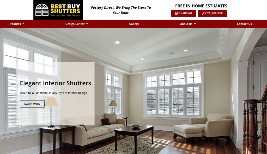
Best Buy Shutters USA

Garry expressed his goals best, “It’s got to look great and it’s got to sell.” Best Buy Shutters is known far and wide across the Las Vegas Valley for the highest quality shutters at affordable prices, delivered on time because they make them right here. We came together at a time when they were struggling to get a website to meet their visual expectations and to drive up the number of leads. They were in the midst of struggling to build out another new and now second website in less than a year. Making things worse, previous sites were loading very slowly and causing incredibly high bounce rates. Since then (3 years ago) we have built two full websites and made countless improvements along the way.

Client goals:

  • LEADS, LEADS, LEADS
  • A great looking product showcase

The Result:

At the outset, we

  • Listened intently
  • Asked a lot of questions
  • Looked over the total landscape of what had been going on
  • Clarified their expectations and goals
  • Studied and assessed the competitive waters
  • Pooled materials available to us
  • Mocked up several home page and interior page design concepts to achieve the desired look and appeal
  • Sourced images
  • Shot custom pictures and video
  • Redesigned the logo
  • Devised a lead generation strategy around their unique benefits and their preferred customer profile

All this was guided and transformed as part of an overall plan to drive effectiveness by using paid search and paid social media campaigns scheduled to launch shortly after website completion.

The client has a great looking website and a considerably higher conversion rate for traffic than in prior years. The functionality of use on both mobile and desktop is very “to the point” and loads quickly on all devices even though the content is image heavy.